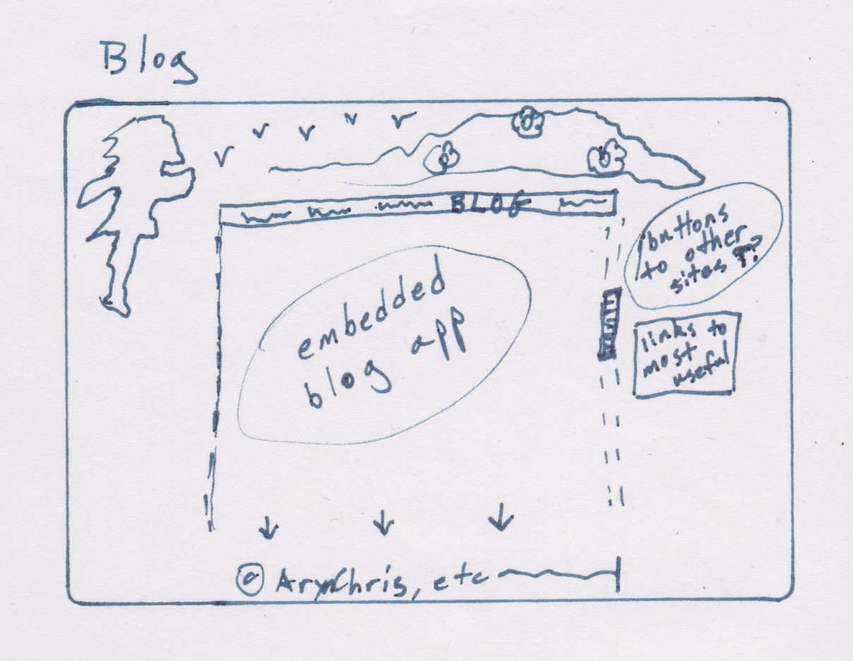
(or some equally short and simple, appropriate navigational header... it would be cool if I could make the link in the fixed navigation bar big/highlighted/emphasized for each page, in some way that lets the viewer know "You Are Here"... or I could have a literal "You Are Here" and red dot... ideas)
This is where I embed my wordpress, or whatever I want to use to compile all my old blogs and journals through the years, including YouTube content. I can only imagine how long it might take to compile that or the amount of editing I'll have to do whenever I find a "new" old journal entry, or how much I'll want to archive from public sight (if anything)... so this is something I should try to put a lot of thought into choosing, and it might be best just to make my own somehow, perhaps by ganking the content code directly from those sites/programs and scrubbing the original locations. Or not. Things to think about.
This is something I currently want on the right, with wrapped text or just in its own space:

If I leave it in its own space, I might throw a vertical nav bar underneath it, like wordpress' year&month bar and/or links to popular things like the How To Commission or I'm A Commissioner or contest articles... though those might be more appropriate on the Contact page. Or I could link them in both, but I want to avoid unnecessary redundancy. Redundancy is useful when there's too much clutter, but it also CREATES clutter, justifying itself... better to avoid.